Bootstrap Utility Classes Explained with Examples – Complete Bootstrap 5 Guide
Introduction
Bootstrap provides hundreds of built-in utility classes that help developers style webpages without writing custom CSS.
Instead of creating CSS rules for every design requirement, Bootstrap offers ready-made classes for:
- Margin
- Padding
- Colors
- Typography
- Display
- Flexbox
- Borders
- Shadows
- Positioning
- Sizing
This makes development faster, cleaner, and easier to maintain.
What are Bootstrap Utility Classes?
Utility classes are small, single-purpose CSS classes designed to perform a specific styling task.
Instead of writing:
.custom-margin{
    margin-top:20px;
}<div class="mt-3">
Content Here
</div>Why Use Bootstrap Utility Classes?
Faster Development
Build webpages without writing large CSS files.
Less Custom CSS
Reduces maintenance and debugging efforts.
Consistent Design
Uniform spacing, colors, and alignment across the website.
Responsive Support
Many utility classes work with Bootstrap breakpoints.
Better Productivity
Focus on development rather than repetitive styling.
Categories of Bootstrap Utility Classes
| Utility Category | Purpose |
|---|---|
| Spacing | Margin & Padding |
| Colors | Text & Background Colors |
| Typography | Font Styling |
| Display | Show/Hide Elements |
| Flexbox | Layout Alignment |
| Borders | Border Styling |
| Shadows | Shadow Effects |
| Sizing | Width & Height |
| Position | Element Positioning |
1. Spacing Utilities
Spacing utilities control margin and padding.
Margin Classes
| Class | Meaning |
|---|---|
| mt-* | Margin Top |
| mb-* | Margin Bottom |
| ms-* | Margin Start (Left) |
| me-* | Margin End (Right) |
| mx-* | Horizontal Margin |
| my-* | Vertical Margin |
Example: Margin Utilities
<div class="mt-5 bg-light">
    Margin Top
</div>

<div class="mb-3 bg-light">
    Margin Bottom
</div>

<div class="mx-auto bg-warning" style="width:200px;">
    Centered Box
</div>
Padding Classes
| Class | Meaning |
|---|---|
| p-* | Padding All Sides |
| pt-* | Padding Top |
| pb-* | Padding Bottom |
| ps-* | Padding Left |
| pe-* | Padding Right |
Example: Padding Utilities
<div class="p-5 bg-primary text-white">
    Padding on All Sides
</div>Large internal spacing around content.
2. Text Utility Classes
Bootstrap provides text formatting utilities.
Text Alignment
<h2 class="text-center">
    Center Aligned Text
</h2>

<p class="text-end">
    Right Aligned Text
</p>
Text Colors
<p class="text-primary">
    Primary Text
</p>

<p class="text-success">
    Success Text
</p>

<p class="text-danger">
    Danger Text
</p>
Font Weight
<p class="fw-bold">
    Bold Text
</p>

<p class="fw-light">
    Light Text
</p>
3. Background Utilities
Background utility classes apply colors quickly.
<div class="bg-primary text-white p-3">
    Primary Background
</div>

<div class="bg-success text-white p-3">
    Success Background
</div>

<div class="bg-danger text-white p-3">
    Danger Background
</div>
Common Background Classes
| Class | Color |
|---|---|
| bg-primary | Blue |
| bg-success | Green |
| bg-danger | Red |
| bg-warning | Yellow |
| bg-info | Cyan |
| bg-dark | Dark |
| bg-light | Light |
4. Border Utilities
Borders can be added without CSS.
Example
<div class="border p-3">
    Simple Border
</div>

<div class="border border-primary p-3">
    Blue Border
</div>

<div class="border border-danger p-3">
    Red Border
</div>
5. Shadow Utilities
Bootstrap provides built-in shadow effects.
Example
<div class="shadow p-3 mb-3">
    Normal Shadow
</div>

<div class="shadow-lg p-3">
    Large Shadow
</div>
Shadow Classes
| Class | Effect |
|---|---|
| shadow-sm | Small Shadow |
| shadow | Normal Shadow |
| shadow-lg | Large Shadow |
6. Display Utilities
Display utilities control visibility and layout.
Example
<div class="d-none">
    Hidden Content
</div>

<div class="d-block">
    Visible Block Element
</div>
Common Display Classes
| Class | Purpose |
|---|---|
| d-none | Hide Element |
| d-block | Block Display |
| d-inline | Inline Display |
| d-inline-block | Inline Block |
| d-flex | Enable Flexbox |
7. Flexbox Utilities
Bootstrap makes Flexbox extremely easy.
Example 1: Center Content
<div class="d-flex justify-content-center">

<div>Centered Item</div>

</div>
Example 2: Space Between
<div class="d-flex justify-content-between">
<div>Left</div>
<div>Right</div>
</div>
Example 3: Vertical Alignment
<div class="d-flex align-items-center" style="height:200px;">
<div>Centered Vertically</div>
</div>
Common Flex Utilities
| Class | Purpose |
|---|---|
| d-flex | Enable Flexbox |
| justify-content-center | Horizontal Center |
| justify-content-between | Space Between |
| align-items-center | Vertical Center |
| flex-column | Vertical Layout |
8. Width and Height Utilities
Control element dimensions.
Example
<div class="w-25 bg-primary text-white">
    25% Width
</div>

<div class="w-50 bg-success text-white">
    50% Width
</div>

<div class="w-100 bg-danger text-white">
    Full Width
</div>
Width Classes
| Class | Width |
|---|---|
| w-25 | 25% |
| w-50 | 50% |
| w-75 | 75% |
| w-100 | 100% |
9. Position Utilities
Bootstrap provides positioning helpers.
Example
<div class="position-relative">
<div class="position-absolute top-0 end-0">
    Notification
</div>
</div>
Common Position Classes
| Class | Purpose |
|---|---|
| position-static | Default |
| position-relative | Relative |
| position-absolute | Absolute |
| position-fixed | Fixed |
| position-sticky | Sticky |
10. Responsive Utility Classes
Bootstrap utilities work with breakpoints.
Example
<div class="d-none d-md-block">

Visible only on Tablet and Desktop

</div>| Device | Visibility |
|---|---|
| Mobile | Hidden |
| Tablet | Visible |
| Desktop | Visible |
Complete Utility Classes Example
<!DOCTYPE html>
<html lang="en">
<head>
<meta charset="UTF-8">
<meta name="viewport" content="width=device-width, initial-scale=1.0">

<title>Bootstrap Utility Classes Demo</title>

<link href="https://cdn.jsdelivr.net/npm/bootstrap@5.3.8/dist/css/bootstrap.min.css"
rel="stylesheet">
</head>

<body>

<!-- Navbar -->

<nav class="navbar navbar-expand-lg navbar-dark bg-dark">

<div class="container">

<a class="navbar-brand" href="#">
Bootstrap Utilities Demo
</a>

</div>

</nav>

<!-- Main Container -->

<div class="container my-5">

<h1 class="text-center text-primary fw-bold mb-5">
Bootstrap Utility Classes Demonstration
</h1>

<!-- Margin & Padding -->

<div class="bg-light border p-5 mb-5">

<h3>1. Margin and Padding Utilities</h3>

<div class="bg-primary text-white p-3 mb-3">
Padding Example (p-3)
</div>

<div class="bg-success text-white mt-4 p-3">
Margin Top Example (mt-4)
</div>

</div>

<!-- Text Utilities -->

<div class="bg-light border p-4 mb-5">

<h3>2. Text Utility Classes</h3>

<p class="text-start">
Left Aligned Text
</p>

<p class="text-center text-primary">
Center Aligned Blue Text
</p>

<p class="text-end text-danger">
Right Aligned Red Text
</p>

<p class="fw-bold">
Bold Text
</p>

<p class="fw-light">
Light Weight Text
</p>

</div>

<!-- Background Utilities -->

<div class="border p-4 mb-5">

<h3>3. Background Utilities</h3>

<div class="bg-primary text-white p-3 mb-2">
Primary Background
</div>

<div class="bg-success text-white p-3 mb-2">
Success Background
</div>

<div class="bg-danger text-white p-3 mb-2">
Danger Background
</div>

<div class="bg-warning p-3 mb-2">
Warning Background
</div>

<div class="bg-dark text-white p-3">
Dark Background
</div>

</div>

<!-- Border Utilities -->

<div class="p-4 mb-5">

<h3>4. Border Utilities</h3>

<div class="border p-3 mb-3">
Normal Border
</div>

<div class="border border-primary p-3 mb-3">
Blue Border
</div>

<div class="border border-danger border-3 p-3">
Thick Red Border
</div>

</div>

<!-- Shadow Utilities -->

<div class="p-4 mb-5">

<h3>5. Shadow Utilities</h3>

<div class="shadow-sm p-3 mb-3 bg-body rounded">
Small Shadow
</div>

<div class="shadow p-3 mb-3 bg-body rounded">
Normal Shadow
</div>

<div class="shadow-lg p-3 bg-body rounded">
Large Shadow
</div>

</div>

<!-- Width Utilities -->

<div class="p-4 mb-5">

<h3>6. Width Utilities</h3>

<div class="w-25 bg-primary text-white p-2 mb-2">
25% Width
</div>

<div class="w-50 bg-success text-white p-2 mb-2">
50% Width
</div>

<div class="w-75 bg-warning p-2 mb-2">
75% Width
</div>

<div class="w-100 bg-danger text-white p-2">
100% Width
</div>

</div>

<!-- Flexbox Utilities -->

<div class="border p-4 mb-5">

<h3>7. Flexbox Utilities</h3>

<div class="d-flex justify-content-between bg-light p-3">

<div class="bg-primary text-white p-2">
Left
</div>

<div class="bg-success text-white p-2">
Center
</div>

<div class="bg-danger text-white p-2">
Right
</div>

</div>

</div>

<!-- Display Utilities -->

<div class="border p-4 mb-5">

<h3>8. Display Utilities</h3>

<div class="d-inline bg-primary text-white p-2">
Inline
</div>

<div class="d-inline bg-success text-white p-2">
Inline
</div>

<div class="d-block bg-warning mt-3 p-2">
Block Element
</div>

</div>

<!-- Position Utilities -->

<div class="border p-4 mb-5">

<h3>9. Position Utilities</h3>

<div class="position-relative bg-light"
style="height:150px;">

<div class="position-absolute top-0 end-0 bg-danger text-white p-2">
Notification
</div>

</div>

</div>

<!-- Responsive Utilities -->

<div class="border p-4 mb-5">

<h3>10. Responsive Utility Classes</h3>

<div class="d-none d-md-block bg-success text-white p-3">
Visible on Tablet and Desktop
</div>

<div class="d-md-none bg-danger text-white p-3">
Visible on Mobile Only
</div>

</div>

<!-- Buttons -->

<div class="text-center">

<button class="btn btn-primary me-2">
Primary
</button>

<button class="btn btn-success me-2">
Success
</button>

<button class="btn btn-danger">
Danger
</button>

</div>

</div>

<script src="https://cdn.jsdelivr.net/npm/bootstrap@5.3.8/dist/js/bootstrap.bundle.min.js"></script>

</body>
</html>
Output:
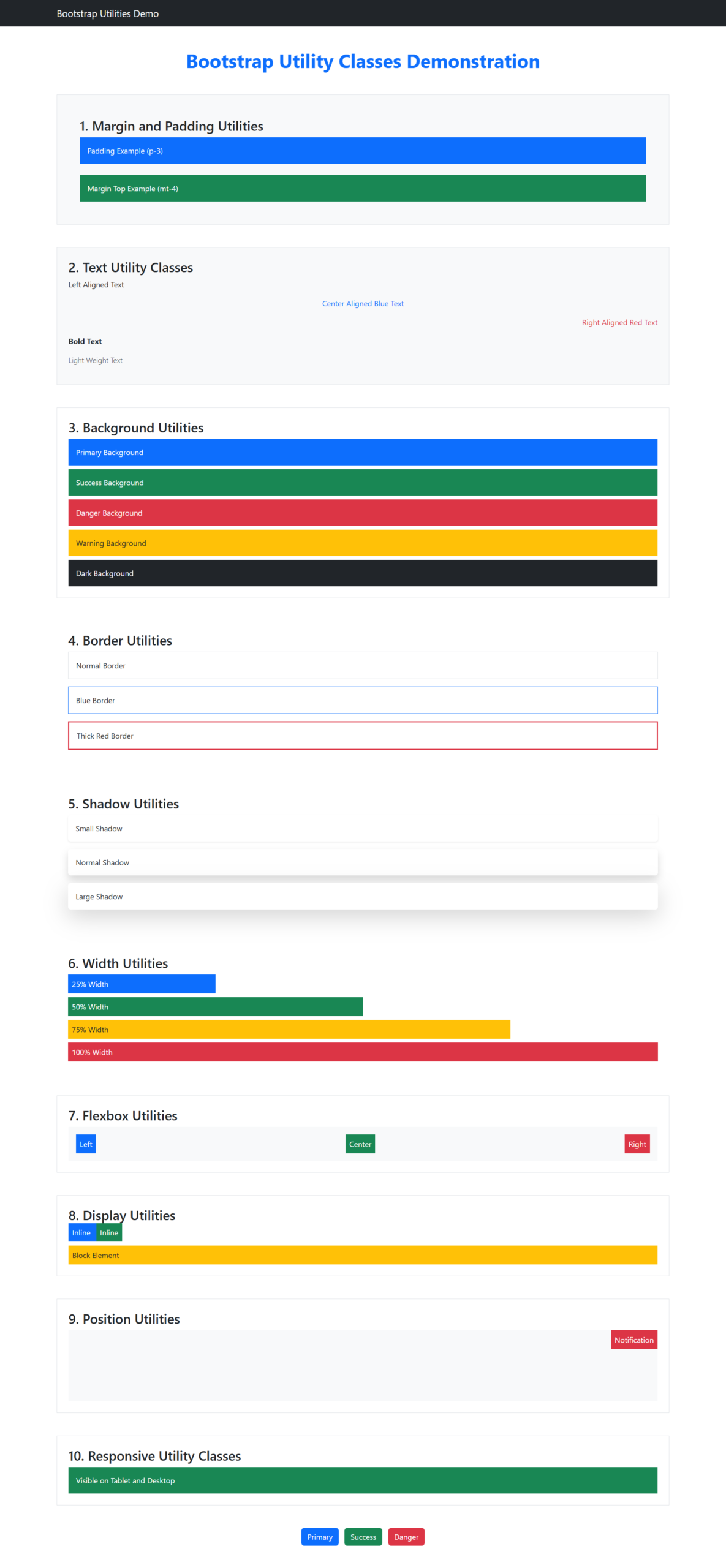
Bootstrap Utility Classes vs Custom CSS
| Feature | Utility Classes | Custom CSS |
|---|---|---|
| Development Speed | Fast | Moderate |
| Reusability | High | High |
| Learning Curve | Easy | Moderate |
| Customization | Limited | Unlimited |
| Maintenance | Easy | Depends on Code |
Best Practices
Use Utility Classes For
- Spacing
- Colors
- Typography
- Alignment
- Flexbox Layouts
- Shadows
- Responsive Visibility
Use Custom CSS For
- Branding
- Advanced Animations
- Complex Layouts
- Unique Design Systems
Common Mistakes
Overusing Inline Styles
<div style="margin-top:20px;"><div class="mt-3">Writing Custom CSS for Simple Tasks
Bootstrap already provides most common styling needs.
Ignoring Responsive Utilities
Use breakpoint-specific utilities whenever possible.
Frequently Asked Questions
What are Bootstrap Utility Classes?
Predefined CSS helper classes used to apply styling without writing custom CSS.
Do Utility Classes Replace CSS?
No. They reduce the amount of CSS required but do not completely replace custom styles.
Are Utility Classes Responsive?
Yes. Bootstrap provides responsive variants using breakpoints such as:
d-none d-md-blockWhy are Utility Classes Important?
They improve development speed, consistency, and maintainability.
Summary
Bootstrap Utility Classes are one of the most powerful features of Bootstrap. They allow developers to quickly style elements using predefined classes for spacing, colors, typography, borders, shadows, sizing, positioning, and responsive behavior.
By mastering utility classes, you can build professional, responsive websites faster while writing significantly less custom CSS.

If some one wants expert view concerning blogging and
site-building then i suggest him/her to go to see this
webpage, Keep up the nice job.
Thanks for valuable feedback.
This paragraph will assist the internet people for setting
up new blog or even a weblog from start to end.
Thanks for valuable feedback.