


Introduction to Tailwind CSS
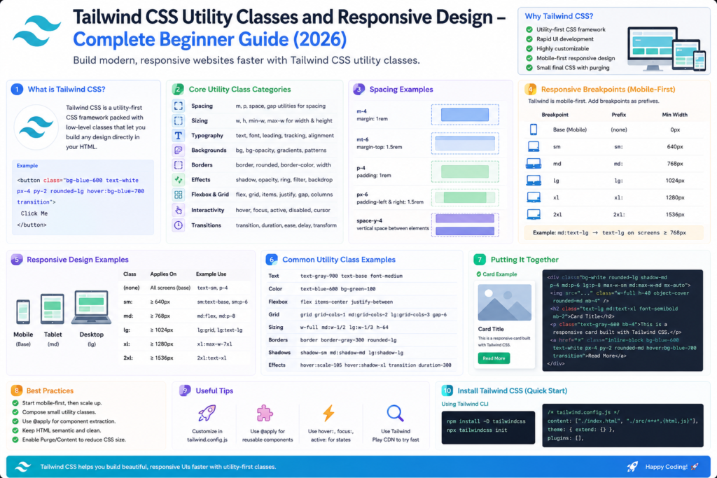
Tailwind CSS is a Utility-First CSS Framework that allows developers to build modern, responsive, and customizable user interfaces directly from HTML using predefined utility classes.
Unlike Bootstrap, which provides ready-made components such as cards and navbars, Tailwind provides low-level utility classes that give developers complete control over design.
Example:
<div class="bg-blue-500 text-white p-4 rounded-lg">
    Hello Tailwind CSS
</div>
Without writing custom CSS, Tailwind automatically applies:
- Background Color
- Text Color
- Padding
- Border Radius
Why Tailwind CSS?
Faster UI Development
Build interfaces directly in HTML.
Highly Customizable
Modify colors, spacing, breakpoints, typography, and themes.
Smaller Production Files
Unused CSS can be removed automatically.
Responsive by Default
Built-in responsive utilities simplify mobile-first development.
Modern Development Workflow
Widely used with:
- React
- Next.js
- Vue
- Angular
- Laravel
Bootstrap vs Tailwind CSS
| Feature | Bootstrap | Tailwind CSS |
|---|---|---|
| Approach | Component Based | Utility First |
| Ready Components | Yes | No |
| Customization | Moderate | High |
| CSS File Size | Larger | Smaller (Production) |
| Learning Curve | Easy | Moderate |
| Design Freedom | Limited | High |
Ways to Integrate Tailwind CSS
There are two popular methods:
Method 1: Without Node.js (CDN Method)
Best for:
- Beginners
- Learning Tailwind
- Small Projects
- College Practical Assignments
Add Tailwind CDN
<script src="https://cdn.tailwindcss.com"></script>Complete Example
<!DOCTYPE html>
<html>
<head>
<title>Tailwind CSS Example</title>
<script src=”https://cdn.tailwindcss.com”></script>
</head>
<body>
<div class=”bg-blue-500 text-white p-5 text-center”>
<h1 class=”text-3xl font-bold”>
Welcome to Tailwind CSS
</h1>
</div>
</body>
</html>


Method 2: Using Node.js (Recommended for Production)
Best for:
- Professional Development
- React Applications
- Next.js Projects
- Large Websites
Step 1
Install Node.js
Step 2
Create Project
mkdir tailwind-demo
cd tailwind-demoInitialize Node Project
npm init -yInstall Tailwind CSS
npm install -D tailwindcssGenerate Configuration
npx tailwindcss initCreate CSS File
@tailwind base;
@tailwind components;
@tailwind utilities;Build CSS
npx tailwindcss -i ./src/input.css -o ./dist/output.css --watchTailwind CDN vs Node.js Setup
| Feature | CDN | Node.js |
|---|---|---|
| Installation | Easy | Moderate |
| Setup Time | 1 Minute | 10 Minutes |
| Learning | Best | Good |
| Production Ready | No | Yes |
| Optimization | No | Yes |
| Custom Theme | Limited | Full |
| Performance | Lower | Better |
Understanding Utility Classes
A utility class performs one specific task.
Example:
<p class="text-red-500">
Hello
</p>
Only changes text color.
Tailwind Color Utilities
Example
<div class="bg-blue-500 text-white p-4">
Blue Background
</div>

<div class="bg-green-500 text-white p-4">
Green Background
</div>

<div class="bg-red-500 text-white p-4">
Red Background
</div>
Spacing Utilities
Margin
<div class="mt-5">
Margin Top
</div>
Padding
<div class="p-5 bg-gray-200">
Padding Example
</div>
Typography Utilities
<h1 class="text-5xl font-bold">
Tailwind CSS
</h1>

<p class="text-lg text-gray-600">
Utility First Framework
</p>
Border Utilities
<div class="border border-blue-500 p-4">
Border Example
</div>
Rounded Corners
<div class="rounded-lg bg-blue-500 text-white p-4">
Rounded Box
</div>
Shadow Utilities
<div class="shadow-lg p-5">
Shadow Example
</div>
Width and Height Utilities
<div class="w-1/2 bg-green-500">
50% Width
</div>

<div class="h-40 bg-blue-500">
Height Example
</div>
Flexbox Utilities
Example
<div class="flex justify-between">
<div>Left</div>
<div>Center</div>
<div>Right</div>
</div>
Grid Utilities
Example
<div class="grid grid-cols-3 gap-4">
<div class="bg-blue-500 p-4">
1
</div>
<div class="bg-green-500 p-4">
2
</div>
<div class="bg-red-500 p-4">
3
</div>
</div>
Responsive Design in Tailwind
Tailwind follows a mobile-first approach.
Breakpoints
| Prefix | Screen Size |
|---|---|
| sm | ≥ 640px |
| md | ≥ 768px |
| lg | ≥ 1024px |
| xl | ≥ 1280px |
| 2xl | ≥ 1536px |
Responsive Example
<div class="bg-red-500 md:bg-green-500 lg:bg-blue-500 p-5">

Responsive Color Change

</div>
Behavior
| Device | Color |
|---|---|
| Mobile | Red |
| Tablet | Green |
| Desktop | Blue |
Hover Effects
<button class="bg-blue-500 hover:bg-red-500 text-white p-3">
Hover Me
</button>
Transition Effects
<button class="bg-blue-500 hover:bg-green-500 transition duration-500 text-white p-3">

Animated Button

</button>
Transform Utilities
<div class="hover:scale-110 transition duration-500">

Hover Zoom Effect

</div>
Tailwind Animation Classes
<div class="animate-bounce">

Bouncing Text

</div>
Dark Mode Example
<div class="bg-white dark:bg-black dark:text-white">

Dark Mode Content

</div>
Tailwind Form Example
<form class="max-w-md mx-auto p-5">

<input type="text" placeholder="Name" class="border p-2 w-full mb-3 rounded">

<input type="email" placeholder="Email" class="border p-2 w-full mb-3 rounded">

<button class="bg-blue-500 text-white px-4 py-2 rounded"> Submit </button>

</form>
Complete Tailwind CSS Demonstration Project
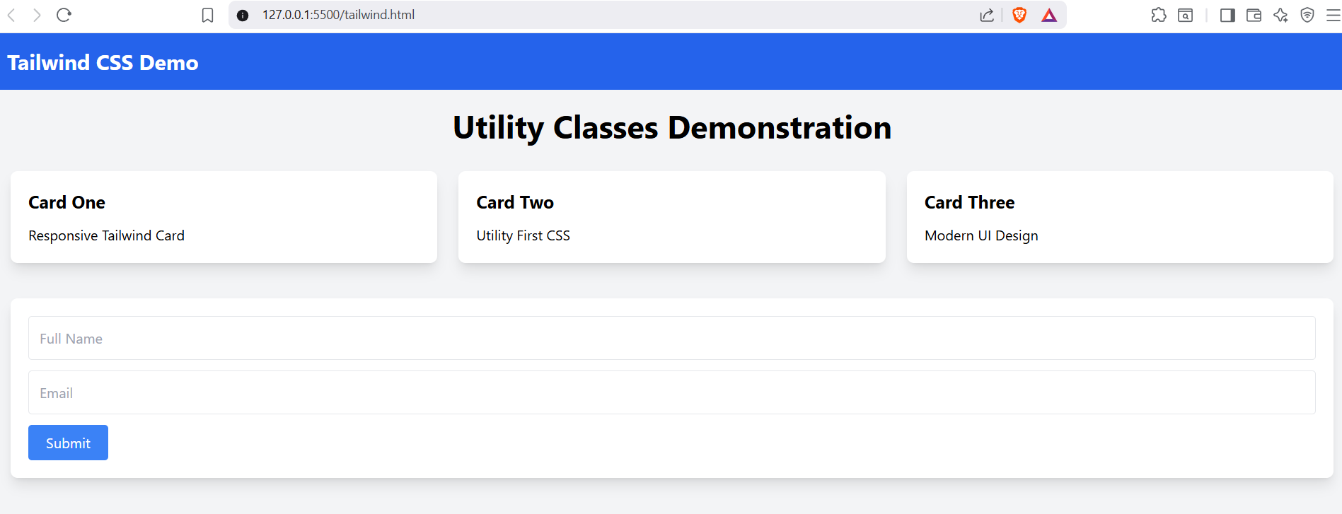
The following project demonstrates nearly all major Tailwind features.
Features Covered
✔ Colors
✔ Typography
✔ Spacing
✔ Flexbox
✔ Grid
✔ Cards
✔ Shadows
✔ Buttons
✔ Forms
✔ Hover Effects
✔ Transitions
✔ Responsive Design
✔ Animations
✔ Utility Classes

Best Practices
Use CDN When
- Learning Tailwind
- Building Small Projects
- Teaching Students
- Creating Lab Experiments
Use Node.js When
- Building Production Applications
- Using React or Next.js
- Creating Enterprise Projects
- Optimizing Performance
Frequently Asked Questions
Is Tailwind CSS better than Bootstrap?
Both are excellent. Bootstrap is faster for ready-made interfaces, while Tailwind provides greater design flexibility.
Is Node.js required for Tailwind?
No. Beginners can use the CDN version.
Why do companies prefer Tailwind?
Because it offers highly customizable designs and smaller production CSS files.
Is Tailwind difficult to learn?
No. Anyone familiar with HTML and CSS can learn Tailwind quickly.
Summary
Tailwind CSS has become one of the most popular CSS frameworks because of its utility-first approach, responsiveness, customization capabilities, and excellent integration with modern JavaScript frameworks.
By learning utility classes, responsive design, flexbox, grid layouts, animations, and form styling, you can build modern, professional websites without writing large CSS files.