


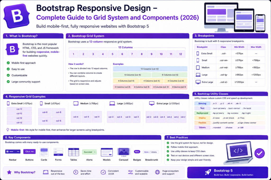
What is Bootstrap?
Bootstrap is a popular front-end framework used to create responsive and mobile-friendly websites quickly.
It provides:
- Predefined CSS classes
- Responsive Grid System
- Ready-made Components
- Utility Classes
- JavaScript Plugins
Instead of writing hundreds of lines of CSS, Bootstrap allows developers to build professional websites using predefined classes.
Why Bootstrap is Popular?

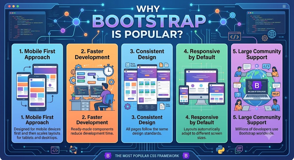
1. Mobile First Approach
Bootstrap is designed for mobile devices first and then scales layouts for tablets and desktops.
2. Faster Development
Ready-made components reduce development time.
3. Consistent Design
All pages follow the same design standards.
4. Responsive by Default
Layouts automatically adapt to different screen sizes.
5. Large Community Support
Millions of developers use Bootstrap worldwide.
Why Do We Add Bootstrap JavaScript?
Bootstrap provides many components that require JavaScript to function properly. While Bootstrap CSS handles styling and layout, Bootstrap JavaScript enables interactive features such as dropdown menus, modals, carousels, tooltips, accordions, and collapsible navigation bars.
Without the Bootstrap JavaScript file:
- Navbar toggles will not open on mobile devices.
- Dropdown menus will not work.
- Modals (popups) cannot open or close.
- Accordions and collapsible panels will not expand.
- Carousels/sliders will not slide automatically.
- Tooltips and popovers will not appear.
Therefore, Bootstrap JavaScript is essential whenever your website uses interactive Bootstrap components.
How to Add Bootstrap?
Add Bootstrap CDN inside <head>.
<link href="https://cdn.jsdelivr.net/npm/bootstrap@5.3.8/dist/css/bootstrap.min.css" rel="stylesheet" integrity="sha384-sRIl4kxILFvY47J16cr9ZwB07vP4J8+LH7qKQnuqkuIAvNWLzeN8tE5YBujZqJLB" crossorigin="anonymous"><script src="https://cdn.jsdelivr.net/npm/bootstrap@5.3.8/dist/js/bootstrap.bundle.min.js" integrity="sha384-FKyoEForCGlyvwx9Hj09JcYn3nv7wiPVlz7YYwJrWVcXK/BmnVDxM+D2scQbITxI" crossorigin="anonymous"></script>This allows using Bootstrap without downloading files.
Why Place the Script Before </body>?
Placing JavaScript at the end of the page offers several advantages:
- HTML content loads first.
- Users can see the webpage faster.
- Better page performance.
- Prevents JavaScript from blocking page rendering.
Recommended structure:
<body>

    <!-- Website Content -->

    <script src="https://cdn.jsdelivr.net/npm/bootstrap@5.3.8/dist/js/bootstrap.bundle.min.js">  </script>

</body>
Understanding Bootstrap Grid System
Bootstrap uses a 12-column responsive grid system.

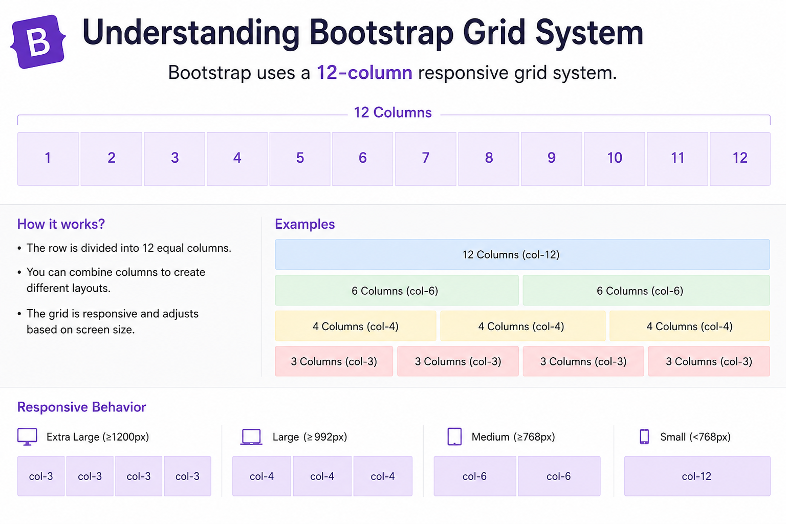
A row can be divided as:
6 + 6
4 + 4 + 4
3 + 3 + 3 + 3
8 + 4
9 + 3
Core Bootstrap Layout Structure
Bootstrap layouts use:
<div class="container">
    <div class="row">
        <div class="col">
        </div>
    </div>
</div>
Components
| Class | Purpose |
| container | Fixed width responsive container |
| container-fluid | Full width container |
| row | Creates horizontal row |
| col | Creates column |
Example 1: Bootstrap Container
<div class="container">
    <h1>Bootstrap Container</h1>
</div>
Output
Content stays centered with responsive margins.
Example 2: Bootstrap Container Fluid
<div class="container-fluid">
    <h1>Full Width Layout</h1>
</div>
Output
Content stretches across the full browser width.
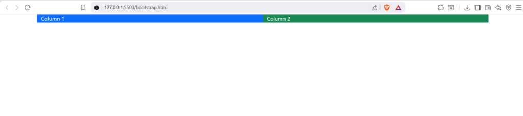
Example 3: Two Column Layout
<!DOCTYPE html>
<html lang="en">
<head>
    <meta charset="UTF-8">
    <meta name="viewport" content="width=device-width, initial-scale=1.0">
    <title>Bootstarp Example</title>
    <link href="https://cdn.jsdelivr.net/npm/bootstrap@5.3.8/dist/css/bootstrap.min.css" rel="stylesheet" integrity="sha384-sRIl4kxILFvY47J16cr9ZwB07vP4J8+LH7qKQnuqkuIAvNWLzeN8tE5YBujZqJLB" crossorigin="anonymous">

</head>
<body>
    <div class="container">

<div class="row">

<div class="col-6 bg-primary text-white">
Column 1
</div>

<div class="col-6 bg-success text-white">
Column 2
</div>

</div>

</div>
 <script src="https://cdn.jsdelivr.net/npm/bootstrap@5.3.8/dist/js/bootstrap.bundle.min.js" integrity="sha384-FKyoEForCGlyvwx9Hj09JcYn3nv7wiPVlz7YYwJrWVcXK/BmnVDxM+D2scQbITxI" crossorigin="anonymous"></script>
</body>
</html>
Output

Example 4: Three Equal Columns
<!DOCTYPE html>
<html lang="en">
<head>
    <meta charset="UTF-8">
    <meta name="viewport" content="width=device-width, initial-scale=1.0">
    <title>Bootstarp Example</title>
    <link href="https://cdn.jsdelivr.net/npm/bootstrap@5.3.8/dist/css/bootstrap.min.css" rel="stylesheet" integrity="sha384-sRIl4kxILFvY47J16cr9ZwB07vP4J8+LH7qKQnuqkuIAvNWLzeN8tE5YBujZqJLB" crossorigin="anonymous">

</head>
<body>
<div class="container">

<div class="row">

<div class="col bg-primary text-white" >
Column 1
</div>

<div class="col bg-success text-white">
Column 2
</div>

<div class="col bg-danger text-white">
Column 3
</div>

</div>

</div>
<script src="https://cdn.jsdelivr.net/npm/bootstrap@5.3.8/dist/js/bootstrap.bundle.min.js" integrity="sha384-FKyoEForCGlyvwx9Hj09JcYn3nv7wiPVlz7YYwJrWVcXK/BmnVDxM+D2scQbITxI" crossorigin="anonymous"></script>
</body>
</html>
Output


Bootstrap Breakpoints
Bootstrap uses breakpoints to make layouts responsive.
| Breakpoint | Device |
| col-sm | Mobile |
| col-md | Tablet |
| col-lg | Laptop |
| col-xl | Desktop |
| col-xxl | Large Screens |
| Breakpoint | Class |
|---|---|
| <576px | xs |
| ≥576px | sm |
| ≥768px | md |
| ≥992px | lg |
| ≥1200px | xl |
| ≥1400px | xxl |
Example 5: Responsive Grid
<!DOCTYPE html>
<html lang="en">
<head>
    <meta charset="UTF-8">
    <meta name="viewport" content="width=device-width, initial-scale=1.0">
    <title>Bootstarp Example</title>
    <link href="https://cdn.jsdelivr.net/npm/bootstrap@5.3.8/dist/css/bootstrap.min.css" rel="stylesheet" integrity="sha384-sRIl4kxILFvY47J16cr9ZwB07vP4J8+LH7qKQnuqkuIAvNWLzeN8tE5YBujZqJLB" crossorigin="anonymous">

</head>
<body>
<div class="row">

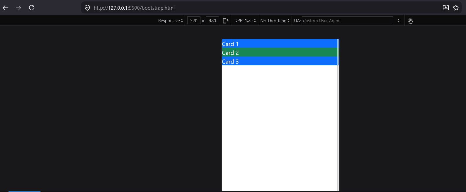
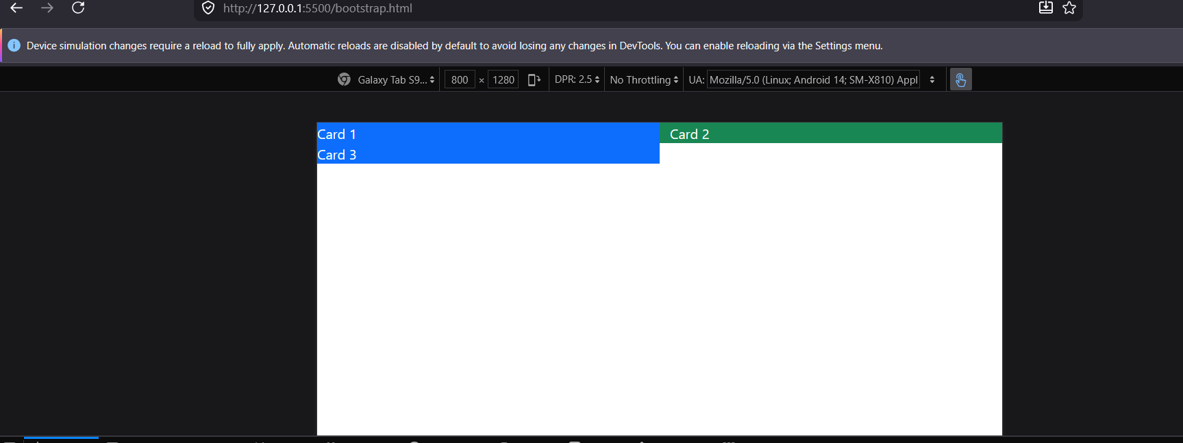
<div class="col-12 col-md-6 col-lg-4 bg-primary text-white">
Card 1
</div>

<div class="col-12 col-md-6 col-lg-4 bg-success text-white">
Card 2
</div>

<div class="col-12 col-md-6 col-lg-4 bg-primary text-white">
Card 3
</div>

</div>
<script src="https://cdn.jsdelivr.net/npm/bootstrap@5.3.8/dist/js/bootstrap.bundle.min.js" integrity="sha384-FKyoEForCGlyvwx9Hj09JcYn3nv7wiPVlz7YYwJrWVcXK/BmnVDxM+D2scQbITxI" crossorigin="anonymous"></script>
</body>
</html>
Behavior
Mobile:

Tablet:

Desktop:


This is the exact responsive concept explained in the experiment.
Bootstrap Components
Bootstrap provides many reusable UI components.
Popular components:
- Navbar
- Cards
- Alerts
- Buttons
- Forms
- Dropdowns
- Modals
- Pagination
- Carousel
Example 6: Bootstrap Navbar
<!DOCTYPE html>
<html lang="en">
<head>
    <meta charset="UTF-8">
    <meta name="viewport" content="width=device-width, initial-scale=1.0">
    <title>Bootstarp Example</title>
    <link href="https://cdn.jsdelivr.net/npm/bootstrap@5.3.8/dist/css/bootstrap.min.css" rel="stylesheet" integrity="sha384-sRIl4kxILFvY47J16cr9ZwB07vP4J8+LH7qKQnuqkuIAvNWLzeN8tE5YBujZqJLB" crossorigin="anonymous">

</head>
<body>
    <nav class="navbar navbar-dark bg-dark">

<div class="container">

<a class="navbar-brand" href="#">
AkshayNextTech
</a>

</div>

</nav>
<div class="row">

<div class="col-12 col-md-6 col-lg-4 bg-primary text-white">
Card 1
</div>

<div class="col-12 col-md-6 col-lg-4 bg-success text-white">
Card 2
</div>

<div class="col-12 col-md-6 col-lg-4 bg-primary text-white">
Card 3
</div>

</div>
<script src="https://cdn.jsdelivr.net/npm/bootstrap@5.3.8/dist/js/bootstrap.bundle.min.js" integrity="sha384-FKyoEForCGlyvwx9Hj09JcYn3nv7wiPVlz7YYwJrWVcXK/BmnVDxM+D2scQbITxI" crossorigin="anonymous"></script>
</body>
</html>
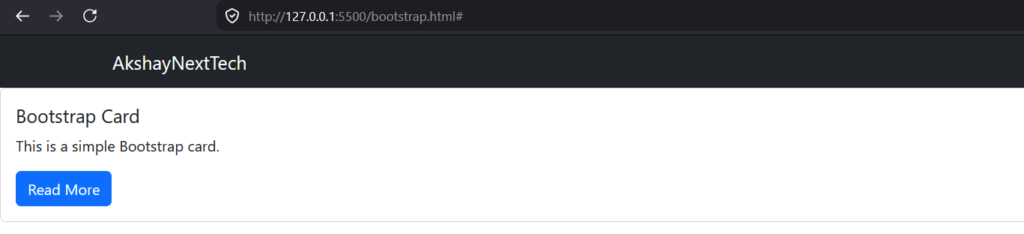
Output
Responsive navigation bar with dark theme.


Example 7: Bootstrap Card
<!DOCTYPE html>
<html lang="en">
<head>
    <meta charset="UTF-8">
    <meta name="viewport" content="width=device-width, initial-scale=1.0">
    <title>Bootstarp Example</title>
    <link href="https://cdn.jsdelivr.net/npm/bootstrap@5.3.8/dist/css/bootstrap.min.css" rel="stylesheet" integrity="sha384-sRIl4kxILFvY47J16cr9ZwB07vP4J8+LH7qKQnuqkuIAvNWLzeN8tE5YBujZqJLB" crossorigin="anonymous">

<body>
    <nav class="navbar navbar-dark bg-dark">

<div class="container">

<a class="navbar-brand" href="#">
AkshayNextTech
</a>

</div>

</nav>
<div class="card">

<div class="card-body">

<h5 class="card-title">
Bootstrap Card
</h5>

<p class="card-text">
This is a simple Bootstrap card.
</p>

<a href="#" class="btn btn-primary">
Read More
</a>

</div>

</div>
<script src="https://cdn.jsdelivr.net/npm/bootstrap@5.3.8/dist/js/bootstrap.bundle.min.js" integrity="sha384-FKyoEForCGlyvwx9Hj09JcYn3nv7wiPVlz7YYwJrWVcXK/BmnVDxM+D2scQbITxI" crossorigin="anonymous"></script>
</head>
</body>
</html>
Output

Bootstrap Button
<!DOCTYPE html>
<html lang="en">
<head>
    <meta charset="UTF-8">
    <meta name="viewport" content="width=device-width, initial-scale=1.0">
    <title>Bootstarp Example</title>
    <link href="https://cdn.jsdelivr.net/npm/bootstrap@5.3.8/dist/css/bootstrap.min.css" rel="stylesheet" integrity="sha384-sRIl4kxILFvY47J16cr9ZwB07vP4J8+LH7qKQnuqkuIAvNWLzeN8tE5YBujZqJLB" crossorigin="anonymous">

</head>
<body>
    <nav class="navbar navbar-dark bg-dark">

<div class="container">

<a class="navbar-brand" href="#">
AkshayNextTech
</a>

</div>

</nav>
<button class="btn btn-primary">
Primary
</button>

<button class="btn btn-success">
Success
</button>

<button class="btn btn-danger">
Danger
</button>

</div>

</div>
<script src="https://cdn.jsdelivr.net/npm/bootstrap@5.3.8/dist/js/bootstrap.bundle.min.js" integrity="sha384-FKyoEForCGlyvwx9Hj09JcYn3nv7wiPVlz7YYwJrWVcXK/BmnVDxM+D2scQbITxI" crossorigin="anonymous"></script>
</body>
</html>
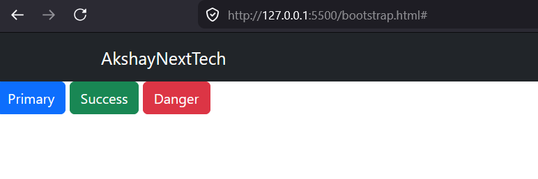
Output

Example 9: Bootstrap Alert
<!DOCTYPE html>
<html lang="en">
<head>
    <meta charset="UTF-8">
    <meta name="viewport" content="width=device-width, initial-scale=1.0">
    <title>Bootstrap Example</title>

    <link href="https://cdn.jsdelivr.net/npm/bootstrap@5.3.8/dist/css/bootstrap.min.css"
          rel="stylesheet"
          integrity="sha384-sRIl4kxILFvY47J16cr9ZwB07vP4J8+LH7qKQnuqkuIAvNWLzeN8tE5YBujZqJLB"
          crossorigin="anonymous">
</head>
<body>

<nav class="navbar navbar-dark bg-dark">
    <div class="container">
        <a class="navbar-brand" href="#">
            AkshayNextTech
        </a>
    </div>
</nav>

<div class="container mt-3">

    <div class="alert alert-success alert-dismissible fade show" role="alert">

        <strong>Success!</strong> Data Saved Successfully.

        <button type="button"
                class="btn-close"
                data-bs-dismiss="alert">
        </button>

    </div>

</div>

<script src="https://cdn.jsdelivr.net/npm/bootstrap@5.3.8/dist/js/bootstrap.bundle.min.js"
        integrity="sha384-FKyoEForCGlyvwx9Hj09JcYn3nv7wiPVlz7YYwJrWVcXK/BmnVDxM+D2scQbITxI"
        crossorigin="anonymous"></script>

</body>
</html>
Output:


Example 10: Bootstrap Form
<!DOCTYPE html>
<html lang="en">
<head>
    <meta charset="UTF-8">
    <meta name="viewport" content="width=device-width, initial-scale=1.0">
    <title>Bootstrap Example</title>

    <link href="https://cdn.jsdelivr.net/npm/bootstrap@5.3.8/dist/css/bootstrap.min.css"
          rel="stylesheet"
          integrity="sha384-sRIl4kxILFvY47J16cr9ZwB07vP4J8+LH7qKQnuqkuIAvNWLzeN8tE5YBujZqJLB"
          crossorigin="anonymous">
</head>
<body>

<nav class="navbar navbar-dark bg-dark">
    <div class="container">
        <a class="navbar-brand" href="#">
            AkshayNextTech
        </a>
    </div>
</nav>

<div class="container mt-3">

<form>

<div class="mb-3">

<label class="form-label">
Email Address
</label>

<input type="email"
class="form-control">

</div>

<button class="btn btn-primary">
Submit
</button>

</form>

</div>

<script src="https://cdn.jsdelivr.net/npm/bootstrap@5.3.8/dist/js/bootstrap.bundle.min.js"
        integrity="sha384-FKyoEForCGlyvwx9Hj09JcYn3nv7wiPVlz7YYwJrWVcXK/BmnVDxM+D2scQbITxI"
        crossorigin="anonymous"></script>

</body>
</html>

Bootstrap Utility Classes
Bootstrap Utility Classes are predefined CSS classes that perform a specific styling task without requiring custom CSS. They help developers quickly apply spacing, colors, alignment, sizing, display properties, and other styles directly within HTML elements.
Instead of writing custom CSS like:
.mt-custom{
    margin-top:20px;
}<div class="mt-3">
Content Here
</div>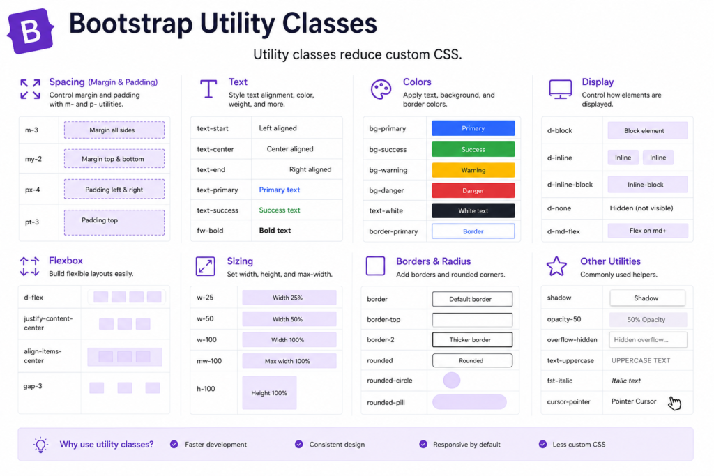
Why Use Bootstrap Utility Classes?
1. Faster Development
No need to create separate CSS rules for common styling requirements.
2. Less Custom CSS
Reduces the amount of CSS code you need to write and maintain.
3. Consistent Design
Provides uniform spacing, colors, and alignment throughout the website.
4. Responsive Support
Many utility classes can be applied conditionally based on screen size.
5. Easy Maintenance
Changes can be made directly in HTML without modifying CSS files.
Common Categories of Utility Classes
| Category | Purpose |
|---|---|
| Spacing | Margin and Padding |
| Colors | Text and Background Colors |
| Typography | Font Size, Weight, Alignment |
| Display | Show/Hide Elements |
| Flexbox | Alignment and Positioning |
| Borders | Border Styling |
| Sizing | Width and Height |
| Shadows | Box Shadows |
| Positioning | Relative, Absolute, Fixed |
1. Margin Utilities
Add external spacing around elements.
Example
<div class="mt-5">
    Margin Top
</div>

<div class="mb-3">
    Margin Bottom
</div>

<div class="ms-4">
    Margin Left (Start)
</div>

<div class="me-4">
    Margin Right (End)
</div>
Common Margin Classes
| Class | Meaning |
|---|---|
| mt-3 | Margin Top |
| mb-3 | Margin Bottom |
| ms-3 | Margin Start (Left) |
| me-3 | Margin End (Right) |
| mx-auto | Center Element Horizontally |
2. Padding Utilities
Add internal spacing inside elements.
Example
<div class="p-4 bg-light">
    Padding on all sides
</div>

<div class="pt-5">
    Padding Top
</div>
Common Padding Classes
| Class | Meaning |
|---|---|
| p-3 | Padding All Sides |
| pt-3 | Padding Top |
| pb-3 | Padding Bottom |
| ps-3 | Padding Left |
| pe-3 | Padding Right |
3. Text Utilities
Control text alignment, weight, and color.
Example
<h2 class="text-center">
    Center Aligned Text
</h2>

<p class="fw-bold">
    Bold Text
</p>

<p class="text-primary">
    Blue Text
</p>
Common Text Classes
| Class | Purpose |
|---|---|
| text-center | Center Align |
| text-start | Left Align |
| text-end | Right Align |
| text-primary | Blue Text |
| text-success | Green Text |
| fw-bold | Bold Text |
4. Background Utilities
Change background colors quickly.
Example
<div class="bg-primary text-white p-3">
    Primary Background
</div>

<div class="bg-success text-white p-3">
    Success Background
</div>| Class | Color |
|---|---|
| bg-primary | Blue |
| bg-success | Green |
| bg-danger | Red |
| bg-warning | Yellow |
| bg-dark | Dark |
| bg-light | Light |
5. Display Utilities
Control element visibility.
Example
<div class="d-none">
    Hidden Element
</div>

<div class="d-block">
    Visible Block Element
</div>| Class | Purpose |
|---|---|
| d-none | Hide Element |
| d-block | Display as Block |
| d-inline | Display Inline |
| d-flex | Enable Flexbox |
6. Flexbox Utilities
Bootstrap makes Flexbox easy to use.
Example
<div class="d-flex justify-content-between">

<div>Left</div>

<div>Right</div>

</div>| Class | Purpose |
|---|---|
| d-flex | Enable Flexbox |
| justify-content-center | Center Horizontally |
| justify-content-between | Space Between |
| align-items-center | Center Vertically |
7. Border Utilities
Example
<div class="border p-3">
    Simple Border
</div>

<div class="border border-primary p-3">
    Blue Border
</div>
8. Shadow Utilities
Example
<div class="shadow p-3">
    Normal Shadow
</div>

<div class="shadow-lg p-3">
    Large Shadow
</div>
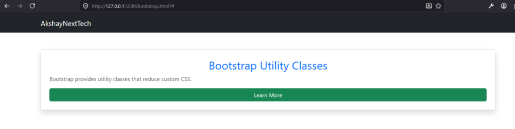
Example Utility Classes
<!DOCTYPE html>
<html lang="en">
<head>
    <meta charset="UTF-8">
    <meta name="viewport" content="width=device-width, initial-scale=1.0">
    <title>Bootstrap Example</title>

    <link href="https://cdn.jsdelivr.net/npm/bootstrap@5.3.8/dist/css/bootstrap.min.css"
          rel="stylesheet"
          integrity="sha384-sRIl4kxILFvY47J16cr9ZwB07vP4J8+LH7qKQnuqkuIAvNWLzeN8tE5YBujZqJLB"
          crossorigin="anonymous">
</head>
<body>

<nav class="navbar navbar-dark bg-dark">
    <div class="container">
        <a class="navbar-brand" href="#">
            AkshayNextTech
        </a>
    </div>
</nav>

<div class="container mt-5">

<div class="card shadow p-4">

<h2 class="text-center text-primary">
Bootstrap Utility Classes
</h2>

<p class="text-muted">
Bootstrap provides utility classes that reduce custom CSS.
</p>

<button class="btn btn-success">
Learn More
</button>

</div>

</div>

</div>

<script src="https://cdn.jsdelivr.net/npm/bootstrap@5.3.8/dist/js/bootstrap.bundle.min.js"
        integrity="sha384-FKyoEForCGlyvwx9Hj09JcYn3nv7wiPVlz7YYwJrWVcXK/BmnVDxM+D2scQbITxI"
        crossorigin="anonymous"></script>

</body>
</html>
Output:

Complete Responsive Example
<!DOCTYPE html>
<html lang="en">
<head>
    <meta charset="UTF-8">
    <meta name="viewport" content="width=device-width, initial-scale=1.0">
    <title>Bootstrap Example</title>

    <link href="https://cdn.jsdelivr.net/npm/bootstrap@5.3.8/dist/css/bootstrap.min.css"
          rel="stylesheet"
          integrity="sha384-sRIl4kxILFvY47J16cr9ZwB07vP4J8+LH7qKQnuqkuIAvNWLzeN8tE5YBujZqJLB"
          crossorigin="anonymous">
</head>
<body>

<nav class="navbar navbar-dark bg-dark">
    <div class="container">
        <a class="navbar-brand" href="#">
            AkshayNextTech
        </a>
    </div>
</nav>

<div class="container mt-5">

<h1 class="text-center mb-4">
Bootstrap Responsive Layout
</h1>

<div class="row">

<div class="col-md-4 mb-3">

<div class="card p-3">
<h5>Mobile First</h5>
<p>Bootstrap starts with mobile layouts.</p>
</div>

</div>

<div class="col-md-4 mb-3">

<div class="card p-3">
<h5>Grid System</h5>
<p>12-column responsive grid.</p>
</div>

</div>

<div class="col-md-4 mb-3">

<div class="card p-3">
<h5>Components</h5>
<p>Cards, Navbars, Forms and more.</p>
</div>

</div>

</div>

</div>

<script src="https://cdn.jsdelivr.net/npm/bootstrap@5.3.8/dist/js/bootstrap.bundle.min.js"
        integrity="sha384-FKyoEForCGlyvwx9Hj09JcYn3nv7wiPVlz7YYwJrWVcXK/BmnVDxM+D2scQbITxI"
        crossorigin="anonymous"></script>

</body>
</html>
Output:

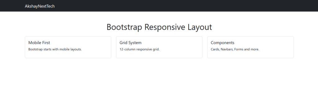
This example is based on the responsive card layout shown in the experiment.
Bootstrap vs Traditional CSS
| Feature | Traditional CSS | Bootstrap |
|---|---|---|
| Development Speed | Slow | Fast |
| Responsive Design | Manual | Built-in |
| Components | Create yourself | Ready-made |
| Grid System | Custom CSS | Built-in |
| Learning Curve | Moderate | Easy |
Common Beginner Mistakes
| Mistake | Solution |
|---|---|
| Not using container | Always wrap content |
| Forgetting row class | Use row before columns |
| Columns exceeding 12 | Total should not exceed 12 |
| Mixing custom CSS excessively | Use Bootstrap utilities first |
Summary
Bootstrap is one of the easiest ways to build responsive and professional websites. Using its 12-column grid system, breakpoints, utility classes, and ready-made components, developers can create modern layouts without writing large amounts of custom CSS.